
The Prompt
The objective of this project was to create an information system that addresses a social problem in our society for a user group who was different from ourselves.
Context
Timeline: 10 weeks (Spring 2020)
Project Type: Class Project (INFO 200)
Team: Hudson Potts, Audrey Kho, Meiqi Liu, Ziyu Lin & I
Programs Used: Figma
My Role: Researcher, UX Designer, Pitch Video Lead
Our Solution
We created Streetlight, an informational and community-building app for the homeless population of Seattle.
Defining the Problem
We decided to tackle the lack of access to the information within the homeless community, specifically in the Seattle area. Without guaranteed access to housing, food, the internet, and many other resources they are in need of a lot of information to help them fulfill these needs.
Learning about Our Problem Space
Method 1: Survey


*unfortunately our survey didn’t get a lot of responses due to time constraints and COVID-19, so we put more emphasis on other research methods
Method 2: Interviews

“Many [people experiencing homelessness] have a network – they are a network – and we’ve seen them help one another with information, share information, and collect resources for themselves and others.” -James
This quote stuck out to all of us, and was a driving force behind our solution. Before researching, we were mostly aimed at providing resources for the homeless, but we realized that weaving in community building would be really important.
Method 3: Secondary Research
We also looked into existing solutions and organizations that try to address these issues.
Several apps already exist that attempt to help, such as OurCalling and HelpFinder NYC. However, we found that users were frustrated with some of the interfaces and didn't find them as useful as they had wished. This helped point us to areas to focus on that other apps haven't been able to address.
The library system is also an invaluable resource because there are public access computers and free WiFi, which many homeless people utilize. Because of their non-judgmental environment public libraries are some of the only places where the homeless feel welcome. However, because libraries have physical locations, it can be taxing to have to locate and walk to them just to find basic information or to ask for help.
From this research, we decided that our app needed to be more user friendly and accessible than these services. We decided to focus our user group on the homeless population only, instead of trying to spread ourselves too thin by also including those who would want to help people that are homeless. The value placed on the local library system also opened our eyes to just how valuable information is, and how ease of access needs to be one of our top priorities for this invaluable resource.
What We Learned
The homeless population is a resource in and of themselves
Access to the internet can be limited for some homeless people, but they access technology and information in a wide variety of ways
Some resources are easier to access than others, but all should be highlighted
The homeless population is very diverse in background and experiences
Homelessness can be very lonely and isolating


Ideation & Decision Making

During our initial problem solving stage we came up with four different solutions to our problem. After further evaluation we decided on solution number four, the mobile app.
The group came together a couple of days later over a Zoom call after mulling over these ideas to make some final decisions. We really liked the idea of screen stations, and thought that it helped address the lack of easy access to technology and the internet. However, we thought that creating an app to be accessed on the screen stations with resources would be just as important. We came to the conclusion that the app would be considered more of an "information resource" than the screen station, but we developed it partially as a secondary solution. Because of our screen station idea, we decided to build the app as if it were to be presented on some kind of screen station (so we designed it for an iPad).
Creating a Design Language
Font
Colors

We opted to use Roboto for the font throughout our app. This font is used in many popular apps. We wanted our app to be user-friendly and welcoming, so using a familiar and easy-to-read font was very important for usability. We used the regular boldness for most of the text but also used medium and bold for titles and other text that needs to stand out.

We wanted to project friendliness and be able to easily catch someone’s eye through the visuals of our app, so we chose three bright colors: Turquoise Blue (5CCDDB), School Bus Yellow (FFD900), and Reef (DBFF99).
We chose a bright yellow as one of our main theme colors because of its association with sunshine and joy. The blue and green colors were chosen because these are Seattle’s theme colors (reflecting the nature surrounding the city, and used by local sports teams like the Sounders and Seahawks) and our solution is targeted towards Seattle’s homeless population.
Logo Design
The name Streetlight was inspired by our design for the screen station, which could also be a metaphor for how our solution would serve as a guiding light to the homeless by providing them with easy access to information and community building. Our app is intended to form a community or "home" for the homeless, which we wanted to incorporate into the logo.
Introducing... Streetlight!
We focused on five main sections and features that would help create connections and community as well as connect users to available resources nearby.
Map: A primary feature of the app is a map of resources. This map would be backed by a database that would update constantly with new information about shelters, food banks and other resources. This feature will connect users with necessary resources that they may not know about. The map will also have a review system so users can communicate to other homeless people which resources are the most beneficial. This will be useful for people who are newly homeless and don’t have prior knowledge of the resources.
Announcements/Forum: The forum within the app will allow the homeless to share resources and connect with each other. Our research showed us that homeless people are often the biggest source of information for each other. This message board would allow them to share their knowledge digitally, which would allow for information sharing between people who would not necessarily meet in person. It could also create more community among the homeless. The announcements page would inform users of upcoming events that they might want to attend. This would bring members of the homeless community together and allow them to interact in-person.
Job Search: This function will provide information of job opportunities for homeless people including position requirements and what is needed to apply. This feature will also allow users to upload a resume. This part of the app would simplify a process that is very difficult.
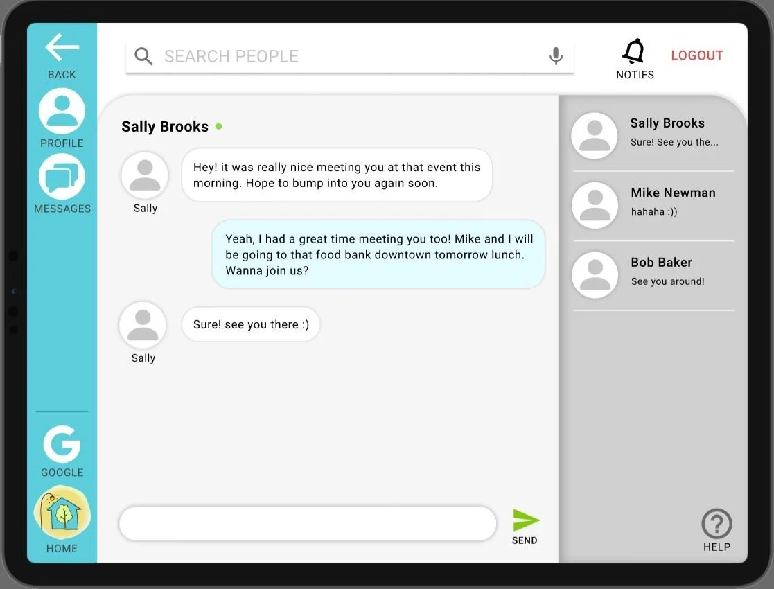
Private Chat: The private chat in the app will allow users to privately message other homeless people they meet in person or via the forums. This will be useful for those people who only want to share certain information with someone instead of the entire community, or so they can learn from people who have been homeless for longer than them. They may also be able to find commonalities, and reduce loneliness through this feature.
Screen Stations: We will consider using stations to help make our app more accessible to people. Important features of these stations include a simple user interface that makes it easy to use for all people. We plan on having these stations serve as Wi-Fi hotspots as well. The stations will be located in public areas especially near large homeless populations. The stations must have a direct power source and be highly durable since they will be outside.
The Screen Station
The idea of the screen station was very appealing to us because some homeless people have a very difficult time accessing the internet. However, we were constrained by time and the format of the project, so we had limited time to spend coming up with a design. We brainstormed some different formats and drew a few low-fidelity sketches, but ultimately decided it wasn't worth the time for this project. Below are our initial sketches.


The Final Product
Reflecting
I enjoyed working on this project and learned a lot. If I were to do it over, I would make a few changes that I think would improve the usability and design of the app. I wish that we had pursued the idea of the screen stations further because it would have been very beneficial in tandem with the app that we built. I also think we should have spent more time considering accessibility, such as different languages and text-to-speech because there is diversity in the homeless population that we didn't account for.
In addition, I think the design of the app could be made sleeker and more professional. However, it was the first time my teammates and I had ever prototyped an app. I think overall, we had good ideas and overcame some difficult circumstances created by the pandemic, and were still able to come together and create this project.