Designing a Digestible Library for Busy Healthcare Professionals
My Role: Lead UX Architect
Company: Omnicom Production (previously FCBHealth NY)
Timeline: 7 months
Programs Used: Figma, Mural, Adobe Workfront, Internal AI
Methods: Affinity Mapping, UX Audit, Content Strategy
Deliverables: Sitemap, Wireframes, Functional Specs, Strategy Slides
Where the Experience was Breaking Down
The original website contained a robust collection of 85+ resources with deep medical content. However, the structure made it difficult for users to locate relevant information quickly.
Information hierarchy reflected internal organization rather than user intent
Important resources were difficult to discover
Engagement metrics suggested shallow exploration
Healthcare providers are time-constrained and cognitively overloaded
The issue wasn’t lack of content — it was lack of clarity.
Understanding the Landscape
Before making structural and feature updates, we needed to dig deeper into the context we’re working in, the user behavior and client goals.
Approach
Reviewed previous user testing and research
Reviewed analytics to understand engagement patterns
Evaluated existing IA and content structure
This phase allowed us to ground the work in evidence rather than assumptions.
Key Insights
Users need recognizable terminology in the navigation
Users need direct access to information and resources
Resources were underutilized due to discoverability issues
Designing Around User Intent
Before
After

We restructured the architecture around how healthcare providers actually seek information and the priorities for our clients. Some of those strategic shifts included:
Reorganized content around user intent
Simplified navigation labels to reduce interpretation effort
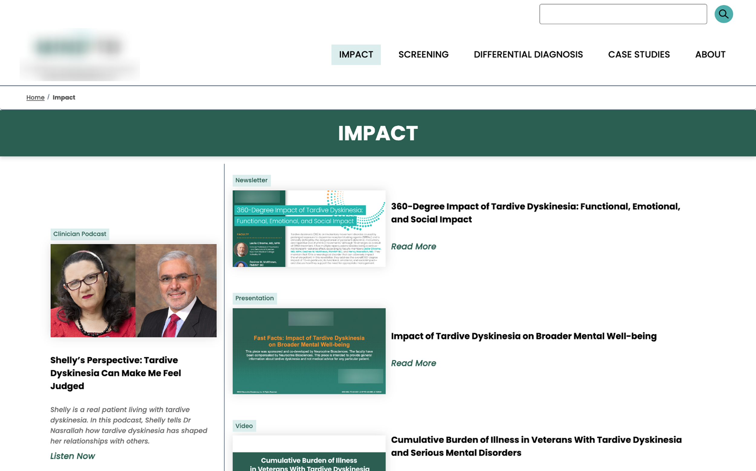
Elevated high-value educational resources, placing content on internal pages instead of burying it
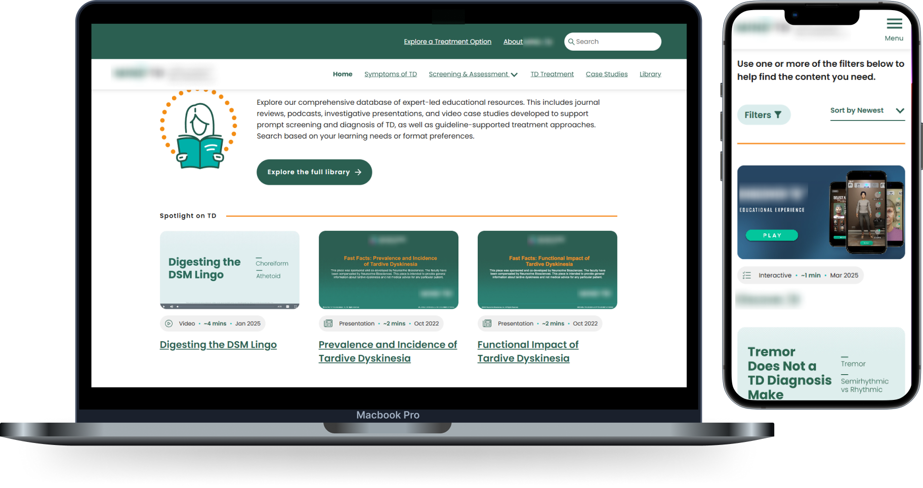
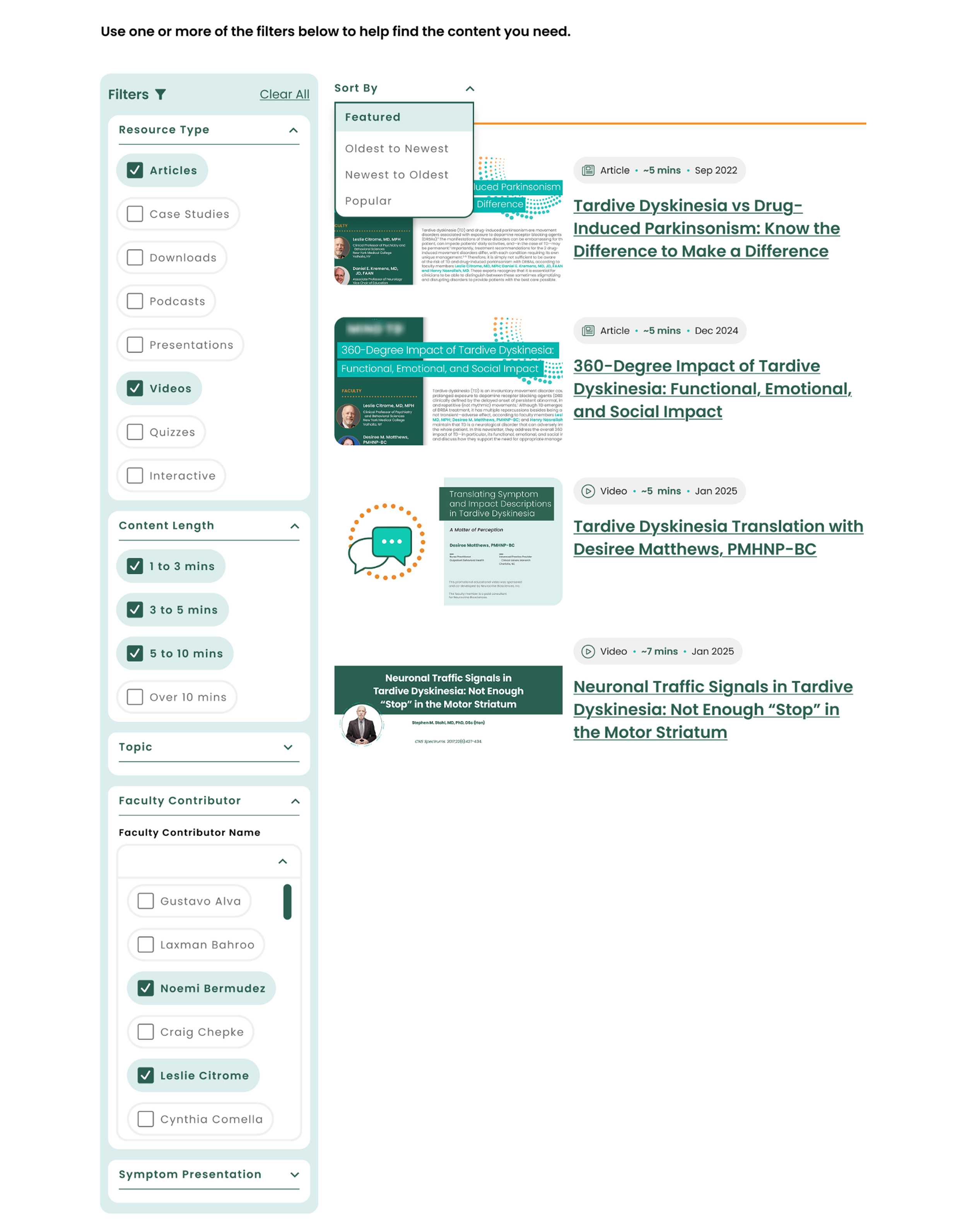
Introduced a library-centric structure, consistently driving users deeper into the collection of resources that are efficently navigated through filtering & sorting
Where Strategy Became Structure
Clarifying the Entry Point
The homepage needed to orient users quickly and support scanning behavior.
Simplified navigation to prioritize primary tasks
Align CTAs with primary strategic goals
Reduced competing content blocks
Strengthened visual hierarchy to clarify pathways
The result: a clearer starting point that respected clinicians’ limited time.

Centralizing Knowledge for Discoverability
Previously underutilized resources were reorganized into a centralized, structured library.
Created a filterable resource hub
Improved tagging and categorization
Supported both quick reference and deeper exploration
The result: high-value educational materials were significantly easier to access.
From Structure to Results
Following launch, the site showed measurable improvements in engagement.
Session duration increased more than 5× (36s → 2m 30s)
Users explored previously underutilized resources
The new IA supported deeper content interaction
Structural clarity directly influenced engagement quality.
Want to dig deeper? A full presentation of this case study — including stakeholder facilitation and tradeoff decisions — is available upon request.